Create Your First Project
Start adding your projects to your portfolio. Click on "Manage Projects" to get started
Healthy Heights Packaging
Logo & Brand Concepting \ Packaging Design
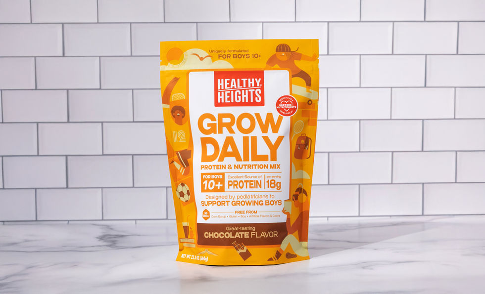
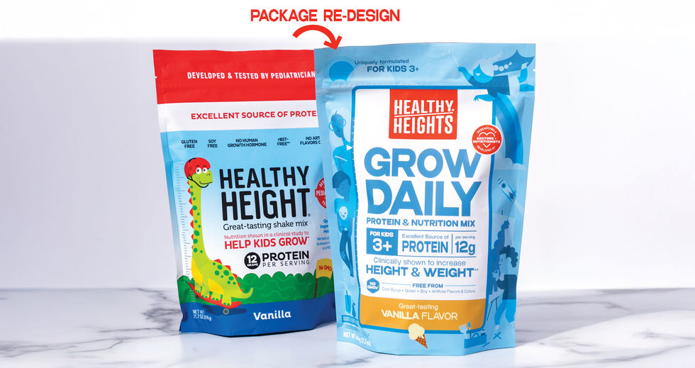
Healthy Heights is a brand that makes nutrition shakes to help with the growth and development of kids. The project was to redesign their brand, logo, and packaging. The main objective was to refresh the look and feel and apply that new look to packaging. Working through this, it became apparent that this updated look really needed to stand out on shelf against its competitors. To do that, it needed to be eye-catching, exciting, inclusive, fun, have taste appeal, and overall be a product that kids would grab and ask their parents to get for them. With all that in mind, the concept of creating a world of aspirational characters doing exciting activities to represent the kid consumers arose.
Working from the original, there was quite a bit of content that needed to be on the front of the package. It made sense then to have all the levels of information front and center in a very clear and organized hierarchy. The typography and layout of this information also needed to support the same look and feel as the framed character world around it. Since the illustrated characters and environment contain a lot of movement around the packaging, it seemed like a nice balance to have very organized typography content in the center. The typeface used felt fun and bold to fit with the bold colors and characters of the design. With a range of different lines of shakes and other products in their offering, this redesign expanded nicely to represent this brand in a new, fresh light.


